From Noise to Insight: A Framework for Usability Metrics with Impact
A practical model for turning usability data into clear, actionable insights - whether you’re running tests or making decisions from them.
Stephanie Wilson
If you've ever run a usability test and walked away feeling more uncertain than informed, you're not alone. It’s common to end up with confusing results or vague insights that don’t clearly point to what should change.
Most traditional usability metrics—like task success rates, time on task, or ease of use scores offer only a partial view of usability. This post introduces a new framework designed to go deeper. It will help you collect more meaningful data, interpret it with greater clarity, and apply the results in ways that drive real design improvements.
Overview
After years of running usability tests using a variety of methods - standard usability metrics, behavioral and attitudinal data, eye-tracking studies, and frameworks like CSAT, SUS, NPS and QX, I began to notice a recurring issue. There was often a clear disconnect between the insights we gathered and the actions product and design teams could realistically take.
This led me to develop a new framework. One that still recognizes task success as a foundational metric, but also goes further, surfacing design improvements that can be clearly categorized, communicated, and most importantly, acted on.
The framework is built around 5 key aspects:
- Task Success - Can a user complete the task successfully?
- Architecture - How easy or difficult is it to discover?
- Language - How easy or difficult is it to understand?
- Feedback - How easy or difficult is it for a user to understand what they’re doing?
- Interaction - How easy or difficult is it to use?
Before we dive into each aspect, let’s first take a look at the metric scoring system.
Metric Scoring System

While Task Success is measured as a simple pass or fail, the remaining four aspects of Architecture, Language, Feedback, and Interaction use a consistent, lightweight scoring system that underpins the framework.
By identifying and counting the number of usability issues in each area, you can assign a clear, trackable score. This provides a baseline score for usability and more importantly, enables teams to monitor progress as changes are made and tested over time.
The goal isn’t to score for the sake of it. It’s to highlight where friction exists, where design refinements are needed, and how usability is evolving in a structured, repeatable way.
Let’s explore each of these four aspects in more detail.
Task Success
Task success has two outcomes: Pass or Fail. It reflects whether a user can complete a task they came to your product or website to do—and it’s the foundation of usability. If a user fails a task, they’ve hit a clear barrier. If they pass, it signals that completion is possible. But task success alone doesn’t tell you everything.
Relying solely on pass/fail results can lead to what’s known as the absence of errors fallacy: just because no issue was observed doesn’t mean one doesn’t exist. A successful task might still involve confusion, hesitation, or unnecessary friction, none of which are captured by task success alone.
In this framework, task success is captured as a simple Pass or Fail per task alongside the four other aspects.

Architecture
The architecture of a product or website is like the structure of a house. When it’s done well, everything feels familiar, logical, and easy to navigate. Good architecture improves the overall flow of the experience and helps users intuitively find what they’re looking for. The phrase “everything in its place” comes to mind when thinking about good architecture and the organisation of information.
In usability terms, strong architecture supports discoverability and reduces friction in navigation. When evaluating this aspect, you're looking for issues like unclear information hierarchy, confusing link structures, or misaligned page flows.
Here are a few key questions to guide your evaluation:
- Is the content organized in a way that makes sense to your users?
- When a user clicks a button, does the resulting view/page reinforce a clear sense of progress or pathway?
- How many steps or wrong turns did the user take to complete a task?
Using the scoring system introduced earlier, you can now apply a consistent measure to evaluate how well the architecture supports usability and track improvements as issues are resolved over time.

Language
The language used in a product or website plays a critical role in shaping the user’s understanding and confidence. Just like signposts in the real world, clear and familiar language helps users know where they are, what they can do, and what to expect next.
In usability, poor language can quietly derail an experience. Confusing labels, ambiguous calls to action, or jargon that users don’t understand can all create unnecessary friction.
When evaluating Language, here are a few things to look out for:
- Are labels and navigation items written in plain, user-friendly terms?
- Do buttons, headings, and instructions clearly communicate what will happen next?
- Is there consistency in terminology across pages, sections, or flows?
- Is error messaging or system feedback phrased in a helpful, human tone?
Using the same scoring system, you can record how often language causes confusion or misinterpretation and surface opportunities to simplify, clarify, and align language with that of your users.
Feedback
In any digital interaction, users are constantly making decisions and they need clear feedback to know whether those decisions are having the intended effect.
Feedback in usability refers to the system’s ability to respond in a timely, meaningful, and understandable way to a user's actions.
Without feedback, users are left wondering:
Did that work?
Should I click again?
Is something wrong?
This uncertainty can create frustration, hesitation, or even abandonment.
When evaluating Feedback, here are some things to consider:
- Does the interface provide immediate, visible responses to user actions? For example, when a button is clicked, is there an animation, state change, or confirmation?
- Is progress communicated for actions that take time? For instance, do uploads, loading screens, or form submissions show that something is happening?
- Does the system acknowledge completion of a task clearly? Success messages, visual indicators, or transitions can reinforce confidence and flow.
Applying the scoring system here helps identify gaps in communication between the user and the system and creates a path for improving trust, clarity, and overall user satisfaction.

Interaction
Interaction focuses on how easily users can engage with the interface to complete their tasks. It’s about the smoothness and intuitiveness of the experience, from tapping a button to navigating multi-step flows.
When interaction design is working well, it feels invisible. But when it breaks down, it often results in friction, frustration, or abandonment.
Here are some key things to look for:
- Ineffective design patterns - For example, unclear touch targets, hidden controls, or unintuitive gestures.
- Excessive steps to complete a task - Tasks that require more effort than necessary or include redundant steps. Could a task be completed in fewer steps or with less complexity?
- Context - Are controls (buttons, toggles, forms) sized and placed appropriately for their context, function and device?
Using the scoring system, this category helps highlight interaction inefficiencies that slow users down or make the experience harder than it needs to be so they can be streamlined or redesigned.

Bringing it all together
Individually, each of these aspects, Task Success, Architecture, Language, Feedback, and Interaction offers a focused lens on different parts of the user experience. Together, they form a more complete, structured framework for understanding usability beyond surface-level metrics.
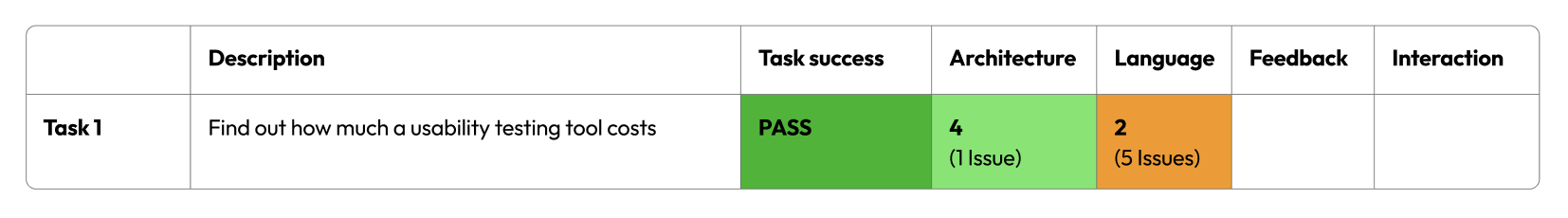
In this example we can clearly see how even though the task could be successfully completed, there are still other issues that can be addressed to improve usability, in particular, the aspect of Language.

By using this framework:
- You move from vague observations to actionable insights.
- You create consistency in how usability issues are captured and communicated.
- You build a shared language that makes it easier for product, design, and research teams to align on what needs attention and why.
Whether you're running moderated sessions, remote unmoderated tests, or heuristic reviews, applying this framework gives you a repeatable way to assess usability, identify where improvements are needed, and track progress over time.
Usability is rarely about one big failure, it’s often the accumulation of small moments of friction. This approach helps you spot and fix them before they add up.
Conclusion
I hope this framework has helped you see how usability testing can go beyond basic metrics and become a more structured, insightful, and actionable part of your product development process.
Is this an approach you could try within your team or organisation?
If you're curious to dig deeper, check out our related post: Beyond Task Success: Designing for Usability That Feels Effortless as it explores in more detail why a single pass/fail metric often falls short.
Need Help?
If you’re new to user research, usability testing and UX or want expert input, we’re here to support you. Whether you're looking for advice, a helping hand or a full independent review, get in touch.
Or, if you’re after a fast way of getting feedback on your prototype or website, check out our online usability evaluations.
